Today, I am happy to share with you our new mobile friendly website design. A mobile friendly site has been something I’ve considered over the years, but it was not something I felt was necessary. That is until last week, when found myself in a discussion on Twitter after Tom Bricker decided to redesign DisneyTouristBlog.com. It turns out I may not have considered it a priority, but you, my awesome readers, wanted a website that was usable on any sized internet capable device.
Below is a screenshot of how the site loads on an iPhone. The regular sidebar content that includes the daily port schedule and other various links are moved below the most recent posts. On some pages, this means a considerable amount of scrolling. To get back up to the top of the page, there is an up arrow that hovers in the bottom right corner that will return you to the top of the page when you tap on it.
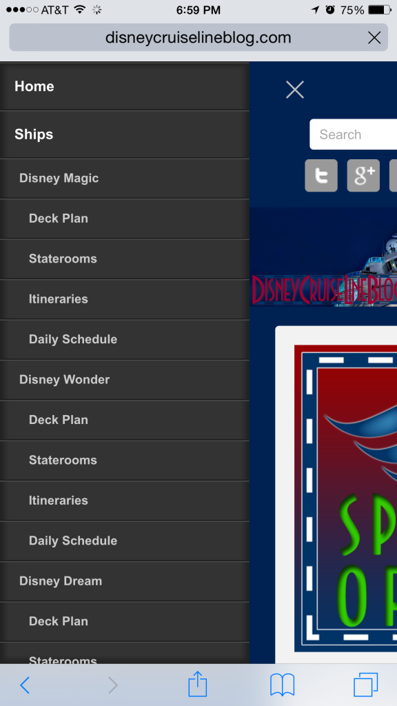
When viewing the site on a smaller screen, you may notice 3 grey lines in the top right of the screen; this is the menu for the website. When you click on the icon, it will expand as shown below:
I want to thank Tom for unknowingly triggering a discussion with Natalie, Jose and David that caused me to move forward and bring the site it to the mobile age. Additionally, I hope these changes help render the pages faster on your end. I am already seeing a noticeable increase in speed on my end.
If you are interested in a few more features that I have in the works, you can get a sneak peek of them at our Movie and Drinks of the Day pages. Both are still works in progress, but they are online now. Development on the new features is on hold until the dust settles from the redesign.
The new design just went live this evening and I am sure there will be some hiccups along the way. So far I’ve tested the site out on a few iOS devices and worked out some of the quirks. If you see something that looks odd on your particular device, please let me know (screenshots are great if you can get one) and I will see what I can do to resolve it.
So… What do you think of the redesign? Be honest – constructive criticism will only help make the site better.


Love it. Nicely done.
Love it! Thank you. 🙂
Well done sir! Love it
Nice use of the android hamburger menu. Can also have it collapse the sub menus?
Example, we would only see Ships and it would expand after touching Ships to show all the ships
Very nice! Much easier to view on my phone.
Looks good on the iphone and ipad in vertical orientation but with the ipad horizontal I don’t think it works – content is in a narrow strip down the middle. Let me know if you want any screenshots.
Andrew, I was able to see the site transition between landscape and portrait on my iPad2. At one point it did hang when going to landscape, but switching the orientation to portrait then back to landscape corrected the layout.
Beautiful! Well done.
Hi Scott. Great job when using iPad an iPhone in portrait position. Much better use of screen real estate.
However on a Mac (or PC) in a regular browser more than half of the width is now used for two wide bars with only a smaller strip in between. When scrolling downs the sidebars are just blue columns waisting horizontal space. For example the daily schedules look really awful when cramped into this small amount of space. I would much rather prefer the desktop version of the site (and landscape on my iPad) to make much better use of the screen width.
Marnix,
I agree. I’ve noticed this myself and am working to change the css to % based widths rather than fixed pixels to adjust for wider screens to eliminate the the wasted space.
Marnix, I just made some changes to make better use of the space.
Scott, when I go to the menus tab, it cuts off the Wonder menu column. Is there something I can do to see it?
Linda,
I am working on a menu update for the site, but in the interim I changed the layout so this is no longer an issue. Thank you for bringing this to my attention.
Nice Redesign.